What’s wrong with MCB Lite card design?
Note: I am not a UI/UX expert. I am just sharing my feelings about this design as a consumer and my little bit experience with design.
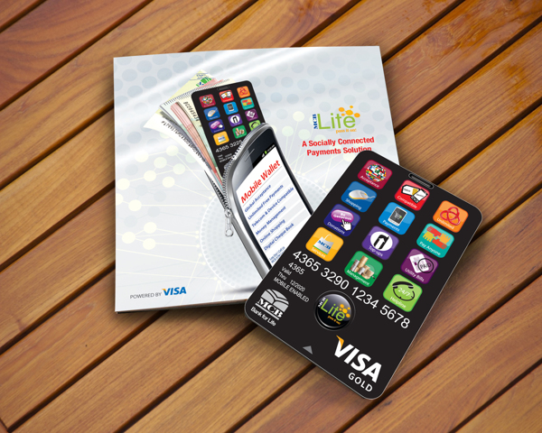
MCB Bank (One of Pakistan’s largest banks) recently introduced its branchless banking product “MCB Lite”. Somehow, as a consumer, I am not satisfied with the design of the card and I am going to share my thoughts about the card design.
The designer tried to give a feel of a smart phone to the card but somehow missed some very basic design principles. Smart phones, especially iPhone, have set very high standards of design and if someone is trying to design something which looks like a smart phone, they’d have to be extra careful. I don’t want to sound harsh but it looks like the card was designed by someone new to design. Printing quality is even worse.
I tried to find out what’s wrong with the design and here are my findings:
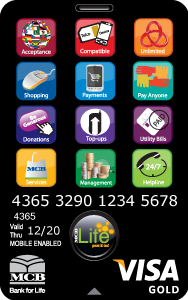
- Spacing between icons is not consistent.
- Text label should NOT be within the icon. Rather there should be no text in app icons.
- None of the icons is designed properly, each and every icon looks like resized clip art downloaded from google images.
- Even positioning of this clip art within the icon is not balanced.
- Text label is not properly center aligned within the icon.
- Text label is not equidistant from edges in all icons.
- Clipart in Pay Anyone icon (6th icon) is stretched horizontally.
- Poor choice of colors for icons.
- Foreground to background contrast ratio in Services (10th icon) and Helpline (12th icon).
- Font size and thickness makes it difficult to read.
And the list goes on….
MCB, I am disappointed by the quality of design (and printing) from a bank like you.